09.03.20Sharing Keila Fernandez’ Orientation Screen for First Graders

How should an online lesson begin? Generally with a warm and gracious greeting and a teacher’s smiling face. Students should feel seen and cared about. They should see their teacher’s face and also be seen.
Then we should get down to learning. And the first step in that is often making sure students have everything they need to be prepared.
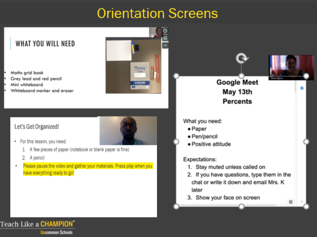
An “Orientation Screen” is a great way to do that; it lets students know what they’ll need to have ready to engage in the lesson it sets them up for success. It takes the key first steps in preparation and makes them both visual and verbal so they are easier for students to follow.
Here are some examples:

Alonzo Hall’s, on the lower left, is a particular favorite. He tells students to pause the video to make sure they have everything ready. But he also establishes that key directions will be highlighted in yellow. If it’s in yellow it’s crucial; if i need to find what’s most important i should scan for the yellow.
But what does an “Orientation Screen” look like when students are little and can’t reliably read the level of text such a screen requires?
This video of Keila Hernandez beginning a math lesson with her first graders at Uncommon’s Ocean Hill Elementary School in Brooklyn provides some answers:
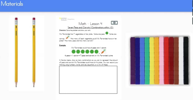
Notice her Orientation Screen is all pictures and no words. Nicely spaced. Simple and easy to follow. Brightly colored but with no extraneous or distracting information. Most first graders could self-manage getting their materials ready based on this screen.
Notice also that there’s a tracker they’ll be using. Keila has sent it in advnace and she’s planned it carefully. That the primary work of the session is paper to pencil is important too. Students remember far more when they read and write in ‘hard copy.’ Looking down at work on paper is a great break from the screen.
Keila’s pacing is also great. She’s efficient but she doesn’t rush.
We also like the simplicity of her images all the way through…. we want an image to have all the right information but nothing extraneous to distract students and take up working memory.
Ideally after this clip students would also get to see her smiling face again through as much of the lesson as possible. That might be one thing to add if you steal some of Keila’s great work.
